Conversion ratio is the new Holy Grail of digital marketing. And quite rightly so! Today, more and more consumers prefer to research online before purchasing any product. According to a Salesforce survey conducted in 2017, 85% of US consumers research online before completing an eCommerce purchase. The number is 79% for in-store purchases. So, no matter whether you are a brick and mortar business or an eCommerce one, most of your customers and prospects are possibly researching about your products and services online, landing on your website via organic or paid search and then making the final purchase decision.
So, the conversion ratio (not just website traffic) of your website is critical for your success. There has been quite a lot of discussion about website conversion ratio. And you probably know a lot about it by now. However, if needed, you can check out our last blog here for a detailed idea about what exactly website conversion ratio is and why it is super-importation for you.
Simply put, conversion ratio is the number of people who performed the desired action vs. the number of people who landed on your website.
The ‘desired action’ can be an indirect goal like downloading an eBook, subscribing for newsletters, registering for a webinar etc, or a direct one like filling up the contact form, scheduling a meeting, booking a demonstration, purchasing a product (for eCommerce businesses, of course) and so on.
The question is how do you improve your conversion ratio? How do you positively influence the people who land on your website to take the next desired step (whatever that might be)? Well, if you are thinking about how to improve your website conversion ratio, then this is the right place.
Here’s some tricks and tips that you can use to improve the conversion ration of your website. Read on!
This is a cliché. And like most clichés, it is true! Nothing repels visitors faster than spammy content. You don’t at all need to be a literally genius to nail this. Simply follow the tips and you can create relevant, engaging and of course conversion friendly content for your website.
This one is the most important points for those who are running any kind of paid search campaign. If you are bidding for a keyword, make sure that your website or landing page is relevant to that. I cannot tell you how irritating that is when I click on a link that says ‘Cute Dog Pictures’ and I land on a ‘Kitten Calendar’ website. Well, not really; I love kittens as much! But, you get the idea, right?
If you can communicate the idea in two words, use two only. Respect your visitors’ time. They are busy and they are coming to your website to look for information. So, give them the information is the most precise form possible.
This includes all design aspects. Making your website a visual pleasure goes a long way in engaging your visitors. Using high quality pictures, icons, illustrations, subheads, heading etc. go a long way in breaking the monotony of text and making the content more presentable.
The reading habit of most users force them to skim the headlines first. Well, personally I hate it! But it is what it is. And therefore, making your headlines as meaningful and engaging as possible is the best way to convince your users to engage with you.
Well, typos are common. They are irritating little mistakes a lot of us are prone to. And to be honest, I’m quite infamous for it! But nobody likes to read a content full of typos. So, pay attention to this little copy monster before putting the content online.
If a picture is worth a thousand words, then a video is probably worth a million. Seriously, videos are the greatest gifts of modern day to marketers. Be it an introductory video, a product demo or a tutorial, if you can showcase it through a video, go for it! However, keep in mind that your videos are high quality and properly placed on the website. None likes to watch a grainy video!
Call to Action aka CTA is the phrase or the word that asks the users to take the next desired action! No wonder it is super important for website conversion. Here’s some tips that’ll help you make the best out of your CTAs.
Placement is super critical when it comes to CTAs. While some positions such as above the fold, near the footer works great for most websites, you’ll also have to consider the content of your website for placing the CTAs strategically. For example, if you are showcasing a number of awesome testimonials on your website, then you might want to place a CTA right after. The logic here is, immediately after reading the testimonials, the trust factor is high and there is a greater chance for your users to take the next step and engage with you. You may also want to put the CTA near your product demo video, product descriptions etc.
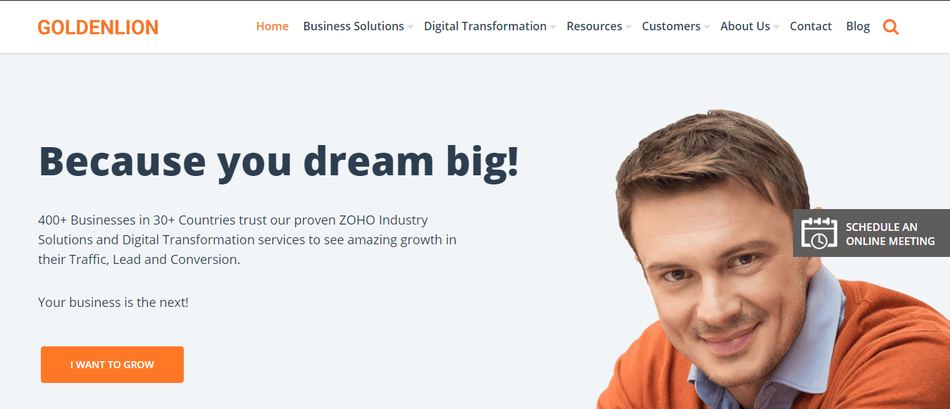
Most websites don’t go beyond ‘Contact Us’ or ‘Buy Now’ when it comes to CTA text. But, think again. Isn’t it THE most important piece of content? Using positive CTAs that talks about the reward goes a long a way in improving your conversion. Here’s an example:

Remember, the user does not want to ‘Download the eBook’, they want to ‘Learn 10 Proven Tips for Digital Marketing’; they don’t want to ‘Contact Us’, they want to ‘Get a No-Obligation Consultation’. Simply highlight the rewards for taking the desired action here.
There is no dearth of discussion and research about which CTA colors are the best for conversion. While a lot of experts have known to favor Orange, Red, Green or Blue as the colors for conversion, you can very definitely go for other colors too. However, do ensure that your CTA color really stands out and captures eyeball. Also, do not, absolutely DO NOT use more than one color for your CTAs. If your need to have two different types of CTAs, go for filled and outlined versions; but stick to the same color.
Think of your website as a brick and mortar store. If your customers cannot find what they need in a store aisle, what do they do? They leave! It is the same when it comes to your website. If your users cannot find what they are looking for, they’ll walk away. So, ensure that your website has a super simple navigation bar.
We are living in an age of instant gratification. None of us wants to wait for communication to take place. Your users are no exception. If they want to reach out to you, they want that communication to take place immediately. So, ensure that you are offering every possible channel of communication that is feasible for you. If you communicate with your customers via phone and email, display your phone numbers and email id prominently.
Setting up a Live Chat tool on your website can improve your accessibility many times. If you do not have enough resources to man the chat window 24/7, you can implement a chat bot to attend to your customers on your behalf. The possibilities are endless here.
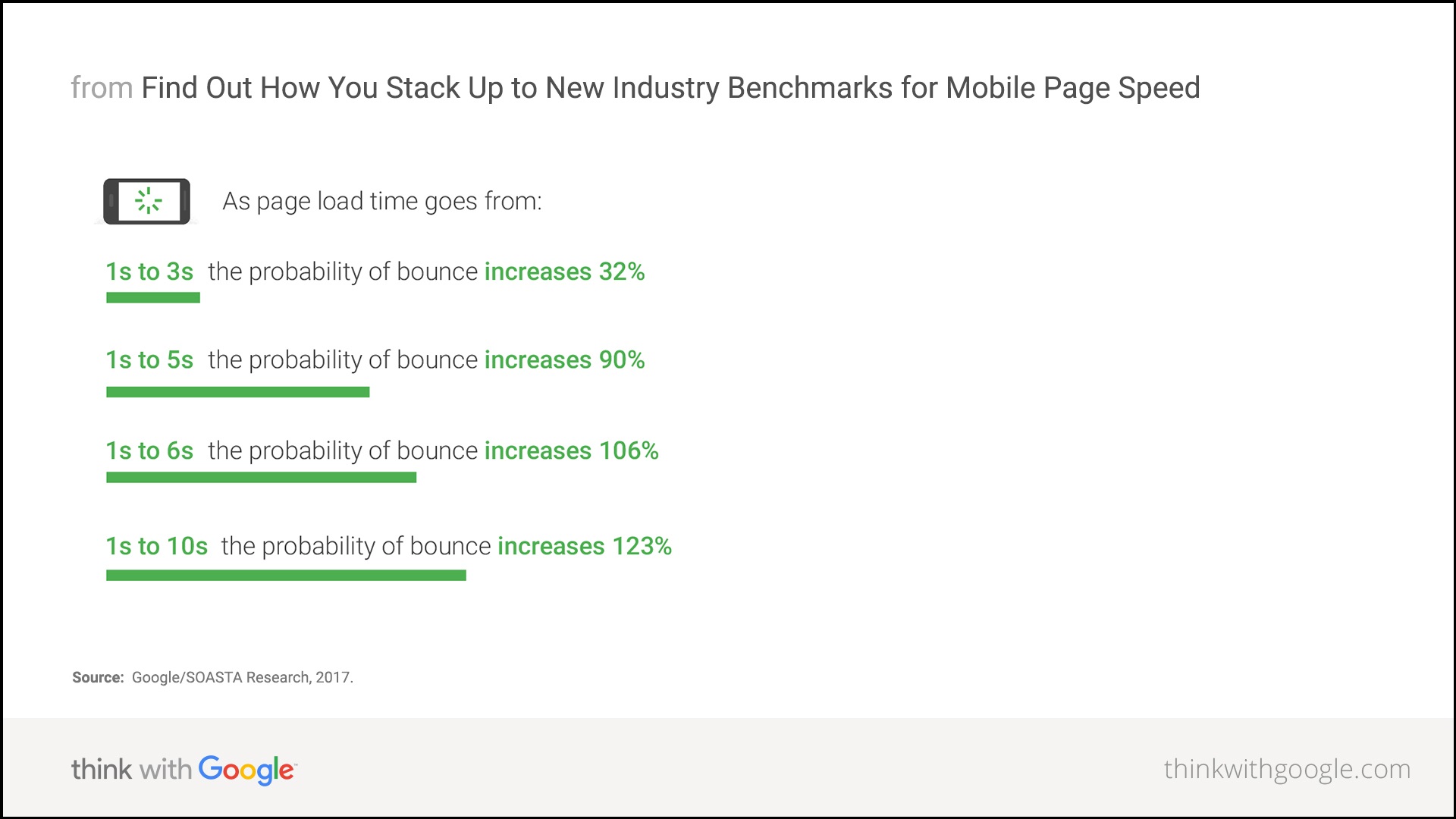
People like fast sites, now more than ever! According to experts, 2 seconds is the threshold for eCommerce sites. So, if your page is taking more than that to load, there’s a huge possibility that your users will leave. The situation is not too different on mobile devices. Here’s a report that shows how page loading speed affects your bounce rate.

Keeping this mind, it is essential that you optimize every element on your website to ensure fast loading time.
Forms are essential for capturing data. Be it a survey or lead generation or any other kind of sign-up, forms are integral parts of the conversion process. And, when it comes to capturing data, most all marketers will give anything to have more. (I know, I will!) But, DON’T get carried away. While you would absolutely love to know as much as possible about any prospect; a lengthy form will only scare them away. So, stick to minimum number of fields and capture only essential data when it comes to forms. You’ll see your conversion going up in no time!
Offering a great user experience is the key to improving your conversion ratio. After everything is said and done, put yourself in the shoes of your users and objectively assess the kind of user experience you are having. Improve user experience, be precise in your CTAs and place them strategically and you are all set to see your conversion ratio go up.