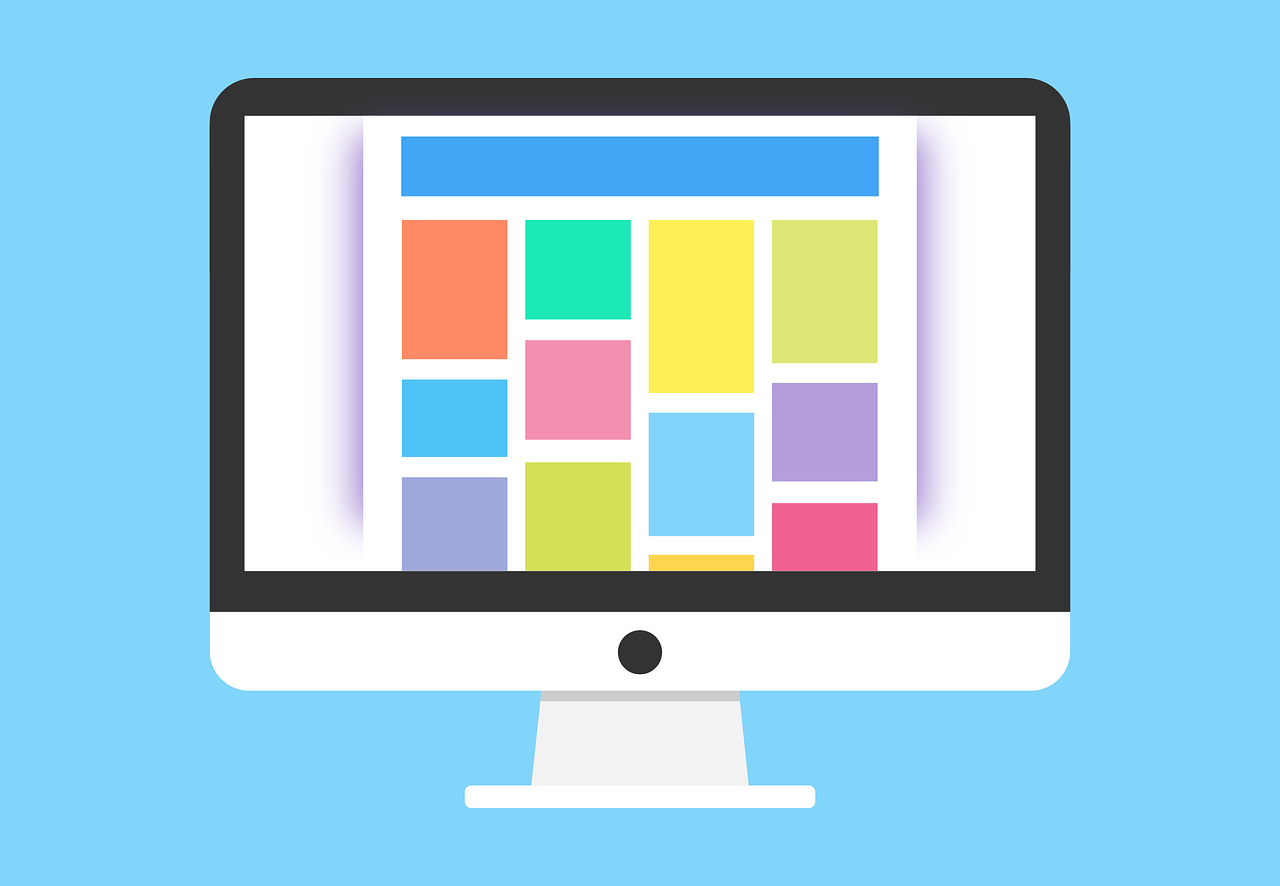
Web design has many responsibilities: make the website look good, ensure the readability of the content, highlight the call-to-action, select and use the right photographs etc etc. But, a website as a whole has one task and one task alone; that is to increase conversion. And every component of a great website is optimized for this purpose. While making a website work is an amazingly tricky business where everything from content to pictures to font sizes have to come together to create an interesting and engaging user experience, one of the most important factors is color.
Why colors? Well, blame human psychology for that!
As it so happens, when we humans look at any particular color, we communicate the same to a certain area of our brains, named hypothalamus. Now, the hypothalamus sends a bunch of stimuli first to the pituitary gland, and then to the thyroid glands. Once this happens, the thyroid glands release certain hormones that regulate mood, emotion, and behavior. So, you see, thanks to these series of signals within our brains, colors wield a significant amount of influence over our attitude and in turn our decision making.
So much so, that we end up making 62% to 90% of all our purchase decisions based on colors!
The bottom line is, you use the right color scheme for your website and you can see your conversion grow magically!
And, this blog is all about how to use color psychology to increase your conversion.
But, before we jump into tricks and tips of color psychology for website design, let us first get an overview of it.
Colour psychology is a branch of behavioral psychology, a broad branch of science that aims at explaining why we do what we do.
Like many branches of human psychology, color psychology too is a widely disputed subject, mainly because human perception of color has as much to do with cultural factors as with biology. While human brain comes programmed to react to colors in the following manner, culture does play a significant role in influencing the feelings too.
However, in a journal published by Satyendra Singh of University of Winnipeg, Canada, the researcher states that human beings take about 90 seconds to form their first opinion about a product or a person. And in 62%-90% of cases, this decision is based on color alone. This finding makes color psychology such as a crucial subject for leaders, business owners, marketers and designers to study.
Colour is ubiquitous. If there’s no color, you call it the color-white. However, when it comes to using colors as a potent conversion tool, there are certain areas of your website where you need to pay special attention.
Below are the website components where you could use proper colors to drive conversion:
Select two or three colors and stick to them: The more the merrier is completely obsolete here. Colours used on your website create a personality for your business and products. Here, using a lot of colors without consideration can seriously hamper your brand personality, and in turn, adversely affect conversion. Maintaining a uniform color scheme by choosing two or three colors (for example, white for the background, grey for highlighting and orange for headings, call-to-actions, buttons etc) can go a long way in building a brand persona for your business.
Keep your target audience in mind: Colour preferences vary widely depending on gender and culture. For example, women tend to like softer colors better, while men prefer bold colors. Moreover, color perception differs as per culture. For example, the color white is associated with sorrow or bereavement in many Asian cultures, whereas Christian brides wear white on their wedding day. Thus, understanding the color preference of your target audience and selecting a color scheme as per their preference is the key to increase conversion.
Do not underestimate the power of white: Color theorists have been debating whether white is a color itself or the absence of any other color for quite some time now. No matter the outcome of this debate, the power of white cannot be overstated. Why, the most popular website, Google is almost all white! White space not only enhances readability manifolds but also gives your website a clean and elegant look, diverting the visitors’ attention where it’s needed the most, like call-to-actions or headlines.
Use bright primary colors for call-to-actions: Call-to-actions are directly related to your website conversion. And thus, it is crucial that they stand out clean and clear to your website visitors. By diverting your visitors’ attention towards the call-to-action you’ll clearly state what your customers can get from you or what is the next step.
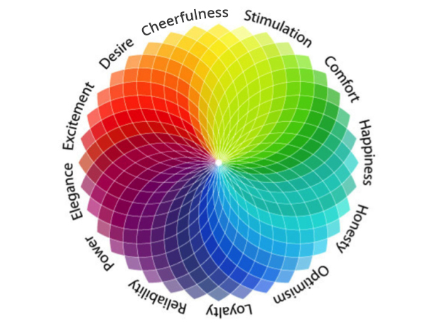
Blue represents loyalty and reliability. This is one of the most used colors in website design today. In the world of color research psychological effects of blue is a proven fact. While there are many variations of blue, almost all of them evoke the feelings of trustworthiness and dependability.
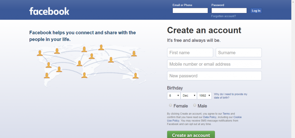
This is why Facebook uses blue as their brand color to promote trust and transparency among their users.
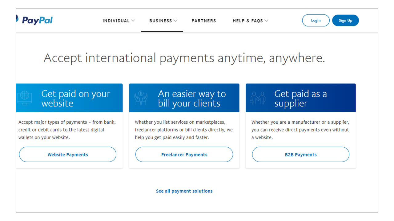
Another international brand who uses the color blue to promote a sense of reliability is PayPal. Ensuring users about the trustworthiness of the business is crucial here, as users generally use PayPal to facilitate financial transactions.
While blue is an excellent color to promote trust and is used avidly by financial, banking and legal businesses, it is a terrible idea when it comes to food or food-related products. The colour’s association with poison and poisoning may be the reason why it has such an adverse effect when it comes to food. So, in case, you are selling food products through your website, better stay clear of blue.
There’s no better colour for holding your visitors’ attention than red. Red is associated with passion, power, excitement and sometimes anger even. While the colour is used to convey dangers, more often than not, it is used to suggest strength and boldness.
Below you can see who Red Hat has used the colour in the background to create a vibrant and youthful look.

While red can be a great color to showcase boldness and youth, the same effect can be attained by thoughtfully using it in the logo, headlines, and call-to-actions.
Here’s how Netflix does it.
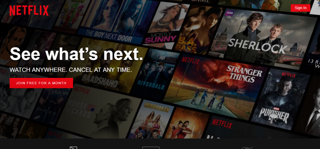
As you can see, Netflix has used red in their logo and call-to-action, making them stand out.
Green is the natural choice when you think about anything related to outdoors, environment, agriculture, nature or eco-friendly. In fact, green is perceived as the very symbol of Mother Nature.
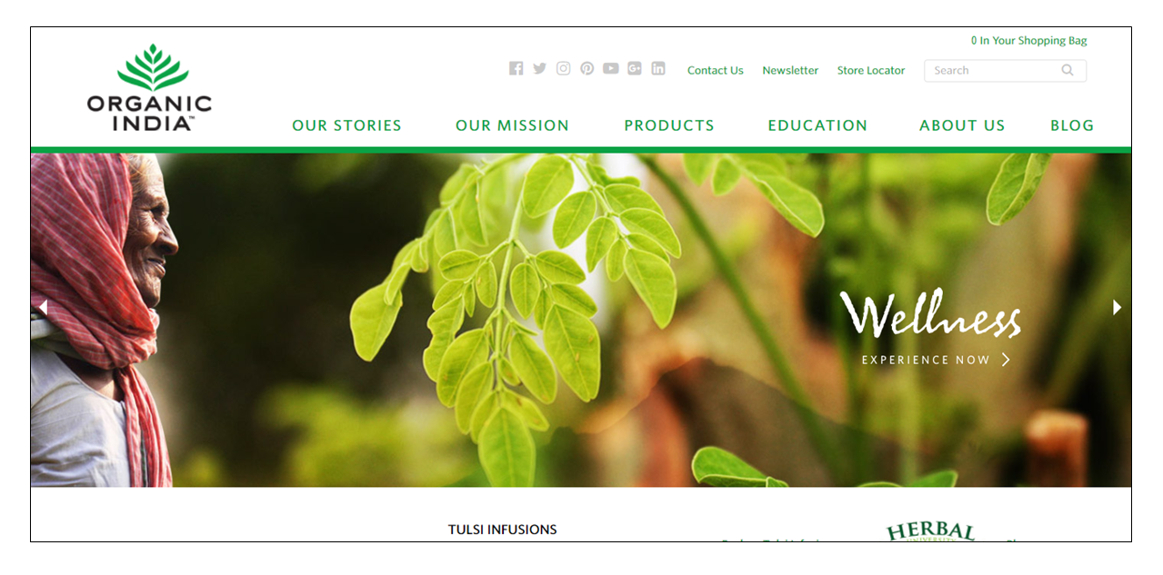
Thus, the color is a favorite for any website related to environment or nature or wellness. Here’s how Organic India, uses it to bring in a feeling of wellness to their website.
The color is known to promote the sense of youth and newness too. This why a technology company, HP is using it here as a background color to promote their newest launch.

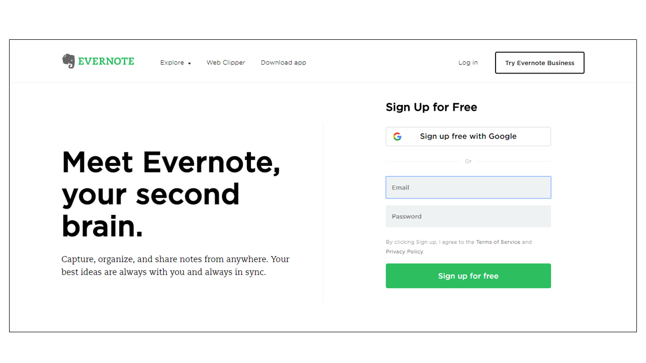
While green is a great theme and background color, it is known as an effective color for conversion too. Thus, it can be a great idea to use green in conversion points and call-to-actions.
Here’s how Evernote does it:
The color yellow is known to promote playful feelings. Associated with the Sun, the color also stands for authority, wisdom, warmth, and happiness.
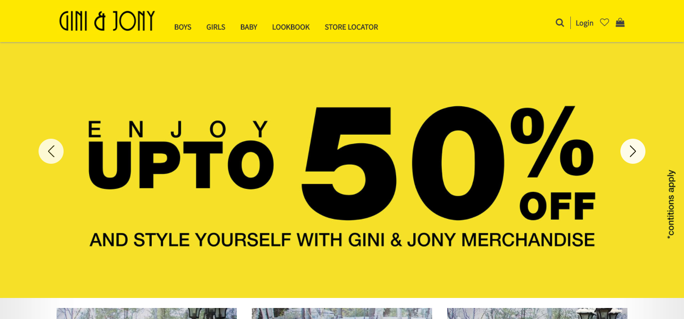
Because of the playful and happy-go-lucky nature of the color, it is a great choice for websites that offer products and services related to kids. Here’s how Gini & Joni, a Kids Wear brand uses yellow as their brand color to promote a fun-playful look.
On the other hand, yellow is used to promote warmth and wisdom as well. Here is a great example, where the color is used to create authority while projecting a warm and friendly image.
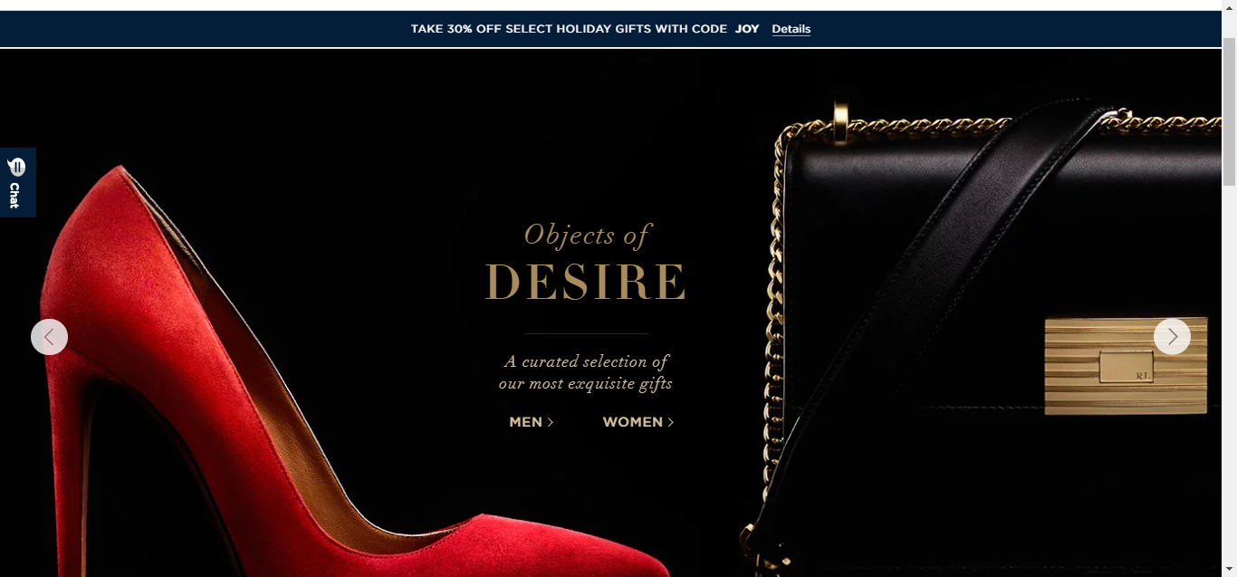
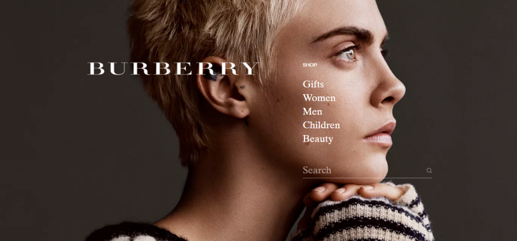
Ahh..black..the color of luxury! Black evokes feelings of elegance, luxury, sophistication, and power! Black is timeless. This is why websites promoting high-value products and luxury goods often use black on their website.
Here are two examples how luxury brands used black to create a sophisticated website.
Example 1: Ralph Lauren
Example 2: Burberry
Colors have the capability to make or mar your website; and thus, care must be taken when deciding on this factor. While a careful study of the target audience, profiling of brand personality and expert guidance care crucial, nothing works better than A/B testing for understanding what works and what does not.
In case, you want some expert consultation on your website design or color selection, feel free to get in touch with us here.